From looking at all of the feedback, I have picked up on the following key points;
- Lip-syncing was very good.
- Cuts was to the beat of the song
- Storyline has a good twist at the end and is easy to follow
- The link between the song and actors singing
- Dancing is in time with the beat of the song
- Good range of different locations
- Happy and upbeat song that people enjoy
Here was some points we had to work on and could improve on;
- The different clothes in different locations wasn't matching to other shots
- The link between the two male characters could be better in the start of the video
- Says the editing could be a little bit faster
- Christmas decorations in the shot could of been removed as does not link to the other shots.
This was all the feedback we got on our music video, the next is the feedback on the album cover we made linking to the music video.
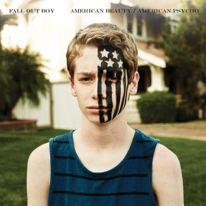
- Photos in the advert had been cut out well and manipulated well and the CD looks realistic.
- Looks professional
- The font and colour schemes works well and is strong.
- The lighting and original images are also a strength
- The people in the advert are the same as the video
- The outside is darker than the inside which is lighter which links to the stories of "You can't judge a book by it's cover"
Some of the improvements was similar but are just as important;
- The stars looks messy
- The cover photo looks blurry
- The CD looks blurry
- Use a wider range of shots
- The advert doesn't match the album design
From looking at all of this, I have worked on improving my production, as well as taking in some comments made by the feedback.
 | ||||||
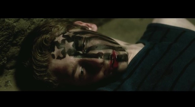
From looking at the feedback, I understand why they stated about the link between James and Harry at the beginning but we felt like we wanted to keep it a secret for the end of the video as we wanted to keep people interested for when we hinted it during the video.
|


 For the disc itself, we used a photo of Jazz and Harry looking at each other. We decided to used to one with both of them as we wanted it to link back to the music video and for the people who had seen the video the album is named after, it will be familiar and will understand the facial expressions they are pulling. We included the track list again as well as the record label and copyright information around the edge of the CD.


