How did you use media technologies in the constructions, research, planning and evaluation stages?
Blogger: I used the website in the planning and construction stages of my production. It's a very simple site that allows you make the simple blog posts, photos, video links and can customize all texts with fonts and colours.
Vimeo; I used this website to upload all footage that I would need for linking it onto my blog. Due to the size constrants for the free use of vimeo, we had to be careful how much we could upload in a week and limit it down below 500mb.
Survey Monkey: We used this site last year for our surveys based on the video we made and we used it again this year with no problems. We could make different kinds of style survey questions and lay them out in different ways. Again, we was only limited to 10 questions and some of the styling options was for a price but we still manage to make a good enough survey with what we had. It allowed us to also read all or specific answers from the survey so finding out the good and the bad answers was quite easy.
Prezi: This was like a online version of powerpoint which included much cooler layout and made it look more visually interesting. It was also very easy to import onto my blog and it allowed youtube and vimeo videos to work straight off it.
Powerpoint; Most of my blog work was created with powerpoint but I did switch between that and Prezi. Powerpoint is free and easy to use so there wasn't any constrictions. Once finishing with my powerpoint, uploading it to blogger ment saving the slides as JPG files started to make my computer files messy but it will allowed me to do some other things that paired sites would want me to do.
Photoshop; Having had past experience with photoshop, being able to use this was much easier due to knowing what I needed to do. We used this on the ancillary tasks to create the CD cover and magazine advert.
Video Camera: We used a little, handheld camera which we used to film all of our music video. It was portable and easy to use and allowed quick upload to the computer ready for editing but sadly the quality is quite low on them so they are not the best quality of camera.
DSLR Camera: We also used a handheld camera to take the pictures for our ancillary tasks. The pictures were of a much higher quality compared to them if they was taken with the video camera or a phone camera.
Tripod: This was the key to making all shots stable and still as well as doing smooth pans and tilts. We used it for both the main video and the ancillary task so they wasn't shaky or blurry.
Messaging: We was able to talk to members of the group and the actors though Facebook and texting which made planning much easier.
Sunday, 28 February 2016

Saturday, 20 February 2016
Evaluation Question 2
How effective is the combination of your main product and ancillary texts?


I think the ancillary tasks captures the same mood as our music video, which is why they work so well together. The photo shoot for the task used a black and white theme which effects the mood of the album but with the doodle, it adds a light hearten feel to the CD which is what happens in the music video. From looking at real world examples, I have seen that other popular pop album covers have also gone for the black and white simple theme.

 With the album cover looking much darker to what the video is, a real life example to work from is Ariana Grande. Her album is with the black and white theme and is very simple and clean where as her videos are much more colorful and quirky.
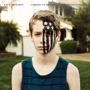
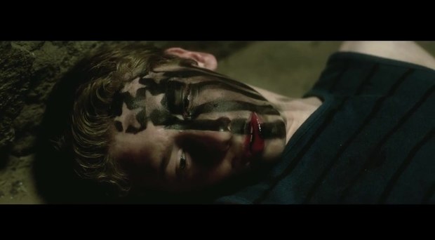
As well as the theme of the album working well with the video,the front cover of the CD has the actor of the video and not of the singer. This was due to changes in the actors timing and we had to get in another singer to replace him but by this time we had already done the photo shoot and had to stick to what we had. A real world example of this is Fall Out Boys American Beauty/ American Psycho album. On the cover, it has a young boy who is nothing to do with the band but in the self titled song, he is the main actor of it and is shown within the video. As well as the actor being shown, the band
does make an appearance as well, very much linking back to our music video and album art work.


 For our advert in the magazine, we used photos from the same shoot but with a white background, giving it a much lighter hearten feel to the album. Because the back and white backgrounds work together, people can link the two together and this will make them more remembered and interesting. photobooth reel on the poster as well to again, give it a light hearten feel but add a twist to the story in the video as they look happy and as a "normal" couple in the images, is slightly different to what goes on in the video.This is why I believe they work so well together as they portray a different story to what goes on and will interest people to see the real story and be shocked to see the truth behind it.

 With the album cover looking much darker to what the video is, a real life example to work from is Ariana Grande. Her album is with the black and white theme and is very simple and clean where as her videos are much more colorful and quirky.
As well as the theme of the album working well with the video,the front cover of the CD has the actor of the video and not of the singer. This was due to changes in the actors timing and we had to get in another singer to replace him but by this time we had already done the photo shoot and had to stick to what we had. A real world example of this is Fall Out Boys American Beauty/ American Psycho album. On the cover, it has a young boy who is nothing to do with the band but in the self titled song, he is the main actor of it and is shown within the video. As well as the actor being shown, the band
does make an appearance as well, very much linking back to our music video and album art work.

 For our advert in the magazine, we used photos from the same shoot but with a white background, giving it a much lighter hearten feel to the album. Because the back and white backgrounds work together, people can link the two together and this will make them more remembered and interesting. photobooth reel on the poster as well to again, give it a light hearten feel but add a twist to the story in the video as they look happy and as a "normal" couple in the images, is slightly different to what goes on in the video.This is why I believe they work so well together as they portray a different story to what goes on and will interest people to see the real story and be shocked to see the truth behind it.
Wednesday, 17 February 2016
Audience feedback
We asked some people to give us feedback on our work to see what they liked, what we can change and improve upon and if they think it hits our targets. We asked media studies students as they would know how to answer the questions fairly as well as some people who doesn't study it so it would feel like a "real" audience members feedback.


From looking at all of the feedback, I have picked up on the following key points;
- Lip-sycning was very good.
- Cuts was to the beat of the song
- Storyline has a good twist at the end and is easy to follow
- The link between the song and actors singing
- Dancing is in time with the beat of the song
- Good range of diffrent locations
- Happy and upbeat song that people enjoy
Here was some points we had to work on and could improve on;
- The diffrent clothes in diffrent locations wasn't matching to other shots
- The link between the two male charaters could be better in the start of the video
- Says the editing could be a little bit faster
- Christmas decorations in the shot could of been removed as does not link to the other shots.
This was all the feedback we got on our music video, the next is the feedback on the album cover we made linking to the music video.
- Photos in the advert had been cut out well and manipulated well and the CD looks realistic.
- Looks professional
- The font and colour schemes works well and is strong.
- The lighting and original images are also a strenth
- The people in the advert are the same as the video
- The outside is darker then the inside which is lighter which links to the storys of "You can't judge a book by it's cover"
Some of the improvments was simulare but are just as important;
- The stars looks messy
- The cover photo looks blurry
- The CD looks blurry
- Use a wider range of shots
- The advert doesn't match the album design
Subscribe to:
Posts (Atom)